The Vireon identity
This is our own brand guide — and a window into what we build for every studio we partner with. A complete identity system that keeps a brand sharp, consistent, and impossible to forget.
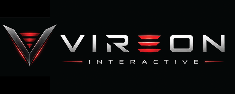
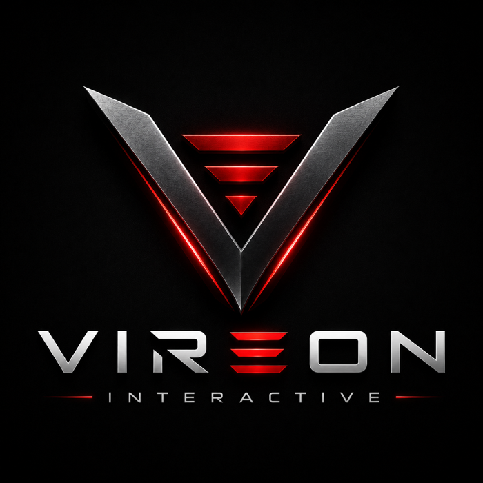
The logo suite
One identity, built for every placement — from a nav bar to a tournament jumbotron.
Flat & monochrome
When the full metallic mark isn't right — small sizes, single-color print, embroidery — the flat system carries the brand.
The palette
Carbon and chrome for the hardware feel; a single, unmistakable red for energy and the win.
Typography
A wide, technical display face for impact; a clean grotesk for everything you actually read.
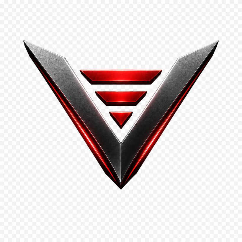
Built with meaning
- The V
Velocity and victory — a forward chevron that always points up and out.
- Three bars
The three founders, descending into a single point of focus and precision.
- Carbon · chrome · red
AAA hardware energy: machined metal, lit by a single competitive red.
What we stand on
The five principles behind every campaign we ship — and the brands we build.
Every client gets a system like this.
Identity, guidelines, and the creative to deploy it — built so your brand stays unforgettable. Let's build yours.